
Brand Design
✸
Brand Design ✸
A collection of brand identities I've had the joy of creating from the ground up, each one thoughtfully shaped to capture who they are, and built to grow with them.

Brands I’ve loved bringing to life…

Primary Logo
Secondary Logo
Favicon Logo
DAYS Branding
DAYS, 2025
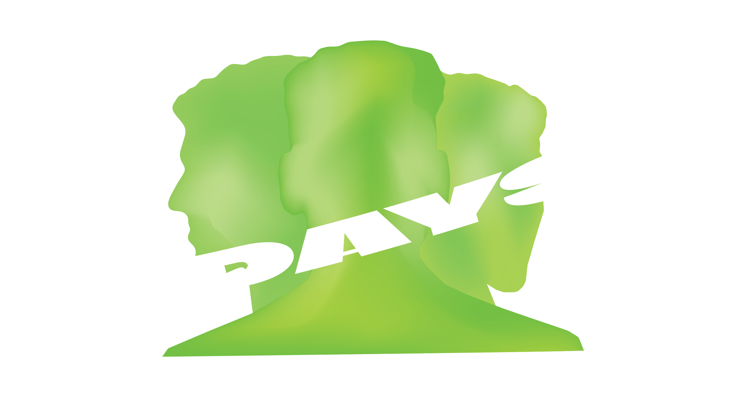
Featured here are the brand guidelines developed to bring the DAYS identity to life and keep it consistent across every platform, including the primary logo, colour palette, and typography.
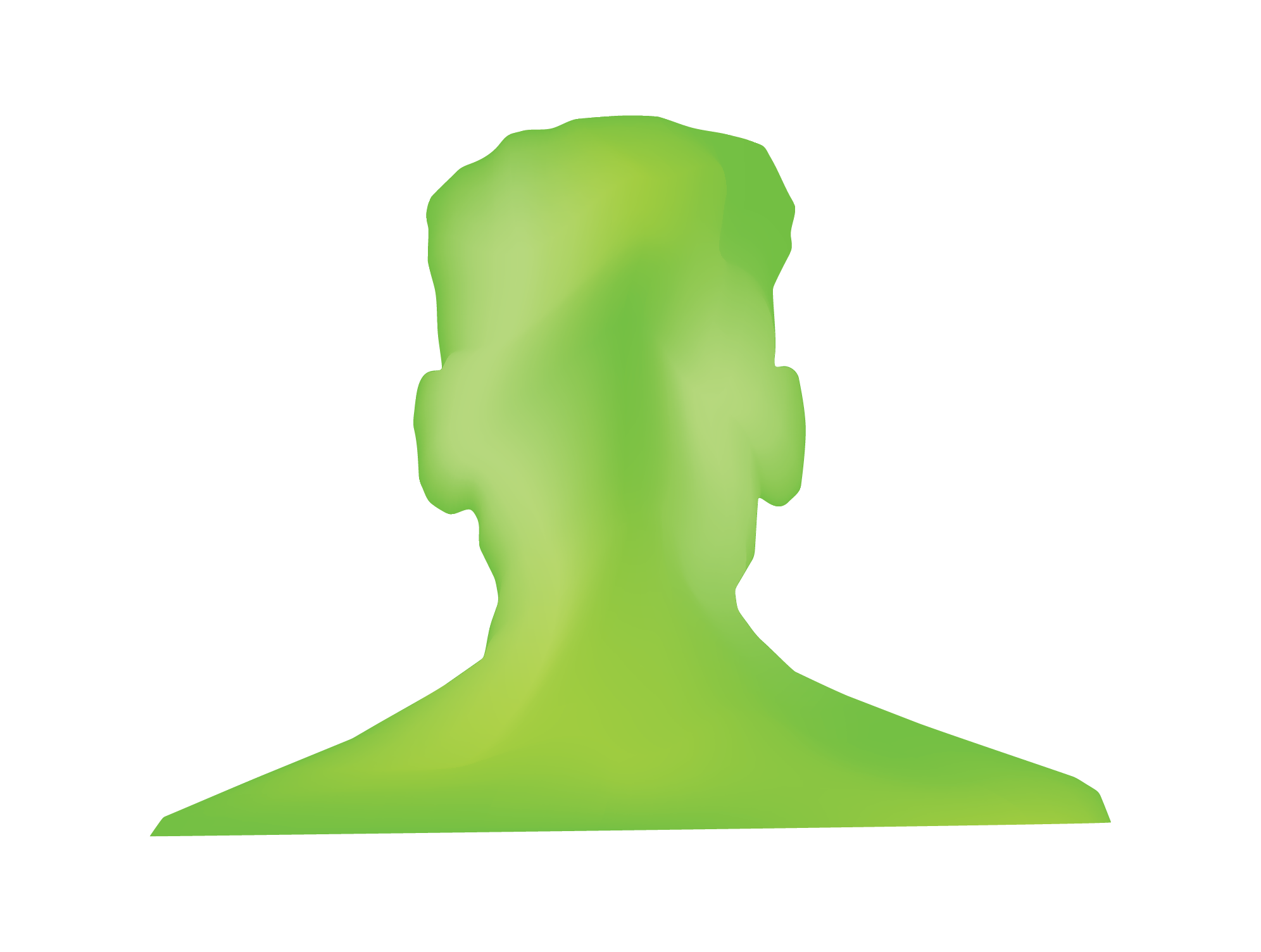
At the centre of the primary logo are three silhouettes of Jordan himself, a personal touch that speaks to his close involvement in the brand and the legacy he's built across his businesses. A bold typeface anchors the brand name within a cylinder shape, while the surrounding ring nods to "staying ahead of the curve," reinforcing a sense of forward-thinking energy. Each silhouette features its own unique green gradient, capturing the bold energy that shifts with every exclusive party DAYS brings to life.
Together, these elements form an emblem that captures the full essence of DAYS — one that should be used above all others whenever possible, as the truest representation of the brand.

Primary Logo

Secondary Logo
Favicon Logo
Still Original Media Branding
Still Original Media, 2024
Featured here are the brand guidelines developed to bring the Still Original Media identity to life and keep it consistent across every platform, including the primary logo, colour palette, and typography.
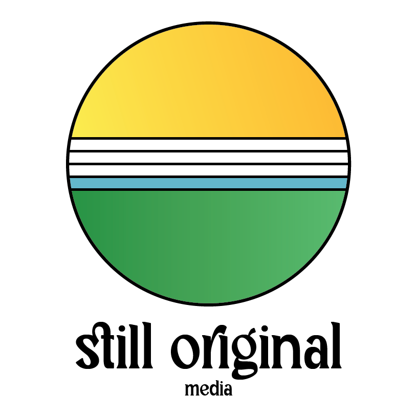
The logo features a thin circular outline, allowing the bold, curved typography of the name to stand out with confidence, creating a nice contrast between illustration and type. Inside the circle, a vibrant yellow paired with a calming green brings a natural, professional feel, embracing the approachability and trustworthiness Still Original Media wants to convey to both current and potential clients. Subtle gradients throughout add a touch of energy and excitement, reflecting the youthful spirit of their clientele.
Together, these elements form an emblem that captures the full essence of Still Original Media, one that should be used above all others whenever possible, as the truest representation of the brand.
Primary Logo
Secondary Logo
Favicon Logo
Angelic Beauty Branding
Angelic Beauty, 2024
Angelic Beauty is a Melbourne-based makeup brand with a mission to inspire and empower people to unleash their divine beauty and embrace their inner glow. The goal of this project was to create a consistent brand identity that captured the brand's elegance and sophistication, one that would help establish credibility, attract new consumers, and grow the brand's audience over time.
Featured here are the brand guidelines developed to bring this identity to life and keep it consistent across every platform, including the primary and secondary logo, a considered colour palette, and the primary and secondary typography.
At the heart of the logo is a circle, designed to represent a halo, a subtle nod to the brand's "angelic" name, which flows into an olive branch symbolising peace, while lending the design a romantic, baroque feel. The circle itself tapers gracefully, starting thin, gradually thickening, then tapering back to a fine line, adding a sense of movement and elegance to the mark. This is paired with two varying serif typefaces, chosen to elevate the logo's sense of sophistication — a quality intended to reflect back onto the products themselves. Finally, a golden gradient was woven throughout the illustration, giving the whole identity a warm, opulent finish befitting the brand.
Primary Logo
Secondary Logo
APNRN Branding
Australian Paediatric Neuropsychology Research Network
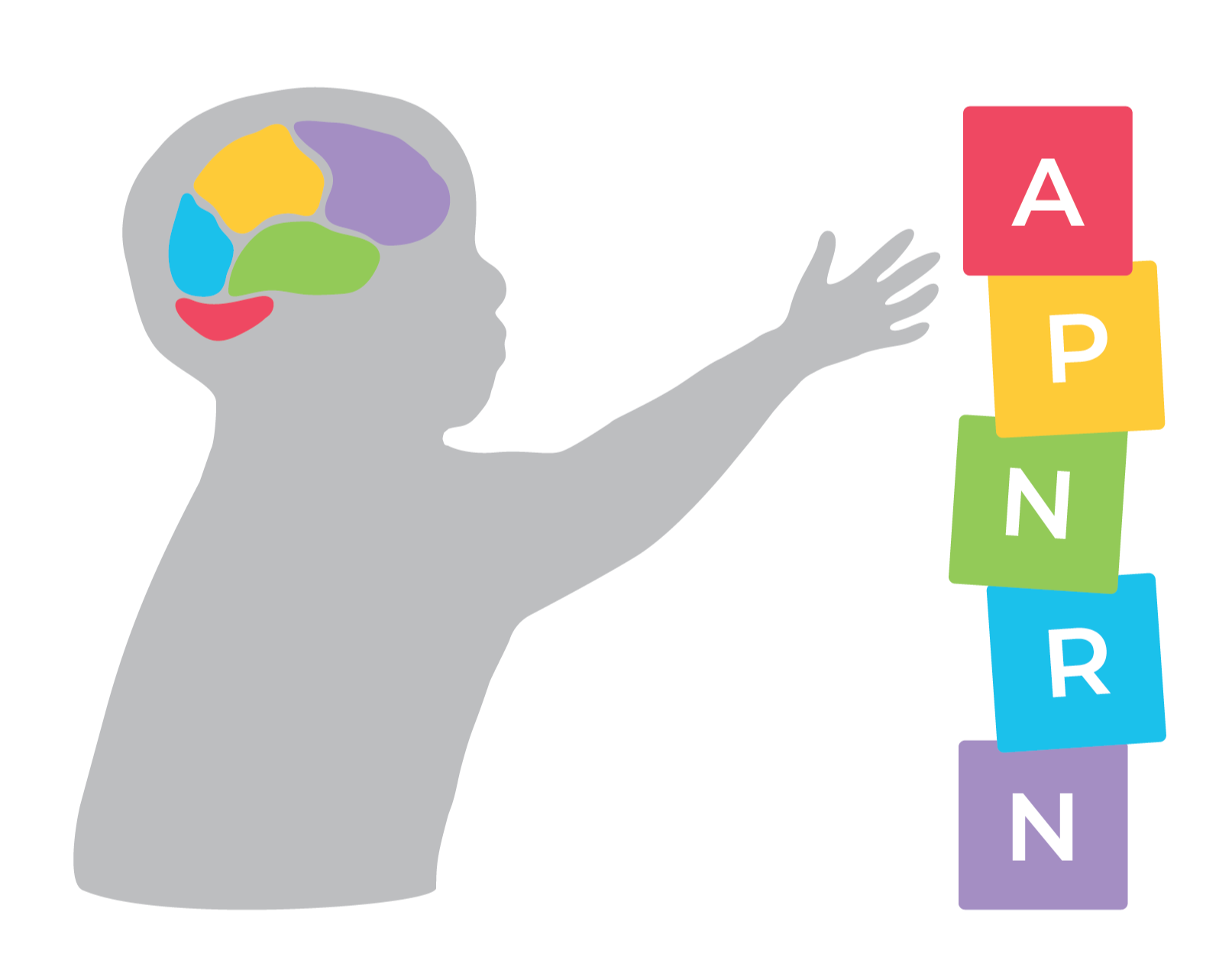
The Australian Paediatric Neuropsychology Research Network is a community of paediatric neuropsychology clinicians, researchers, and students in training. They came to me wanting a new logo, one that could better represent their values and the important work they do, along with a matching flyer and PowerPoint template to showcase their work and share information more broadly. I was incredibly proud that my design was the one chosen, among many student submissions, to represent the organisation.
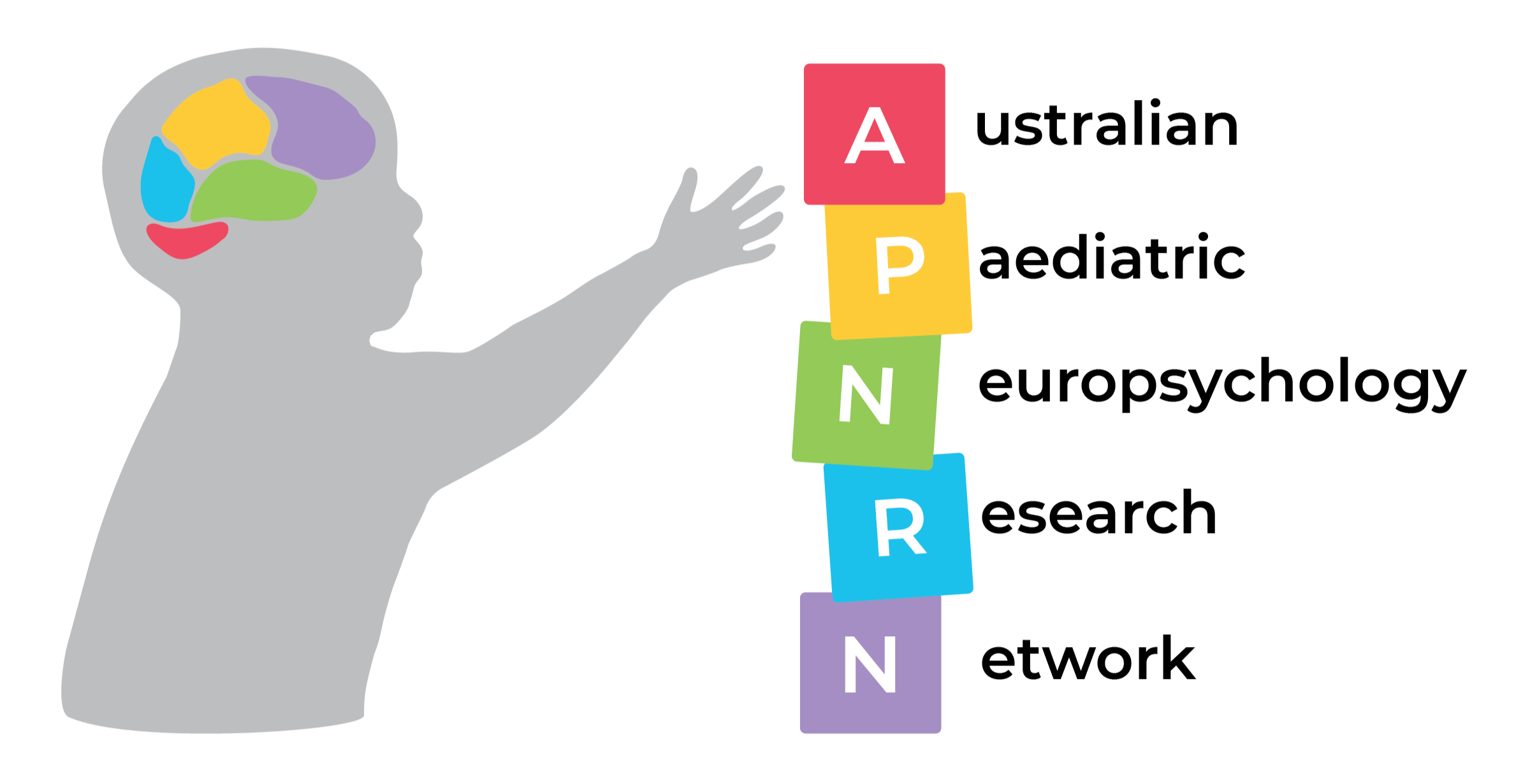
The logo was designed to reflect one of the many activities the organisation uses to explore a child's neuropsychology, captured through an illustration of a brain divided into its different lobes and sections. Alongside this, the typography draws on the look of wooden lettered blocks, a subtle nod to the tools and activities often used when testing children's neuropsychological development. A child's silhouette also sits at the centre of the design, reinforcing that children are, and always will be, the true focus of the organisation's work.
Five distinct colours run throughout the logo, each representing a different part of the brain — and each one deliberately connected back to the wooden toy blocks, tying together the idea of playful activity and the way it helps stimulate a child's developing brain.
Novicate Academy Branding
Novicate Academy, 2022
Novicate is a community-first tutoring group with a clear mission — to help high schoolers achieve better grades while uncovering their career dream pathways. To help bridge the gap between career exposure and high school students, Novicate blends live tutoring with ongoing academic and career support, connecting students with top-tier tutors and a growing pool of career mentors.
During my internship with Novicate, I produced a full brand styling guide to help them better represent themselves and their values across every touchpoint. This guide brought a new level of consistency to the brand, ensuring every element — from visuals to voice — could work together cohesively as one unified identity.